Printing Fundamentals: How to Set Up Your Print
Printing Fundamentals: How to Set Up Your Print
Setting up your file for print can be confusing if you are unfamiliar with how the print industry works. From understanding the difference between RGB and CMYK, vector and bitmap images, to applying crop marks to your file, there are several important factors to consider. It can be frustrating to receive your printed goods only to find unwanted colour changes, important sections removed, or incorrect sizing. With GD Print's 40+ years of print experience, we'll break down some of the most common problems customers face when setting up artwork for print and answer them throughout this article.
RGB vs CMYK Explained
RGB (Red, Green, Blue) and CMYK (Cyan, Magenta, Yellow and Black) are the two primary colour models used for design and printing, they represent how each system renders the colours and the output of that processing. Computer screens render colour in RGB, millions of microscopic hues of red, green and blue that, when combined together, create a moving or still image on your screen. Most commercial digital printers use the CMYK colour model, applying millions of tiny cyan, magenta, yellow and black dots to a white surface. These dots are placed in precise patterns and densities, blending together to create the full range of colours perceived by the human eye.
Can I Print in RGB?
It is impossible to print in RGB, so converting your colours to CMYK is ultimately unavoidable when printing, making it crucial to prepare your artwork in the correct colour mode, otherwise there may be confusion to some users when their print comes out more muted than how it looks on the computer screen.
Popular applications, such as the Adobe suite, allow you to view your work in CMYK, simulating how the colours will appear when printed by adjusting the colours displayed on your screen. This is particularly relevant for artists or any profession that is looking for an accurate representation of how their artwork will appear in print compared with how it looks on screen.
Can CMYK be Vibrant?
CMYK can be vibrant as long as you prepare for it, printing in CMYK does not necessarily guarantee a worse or lesser print quality, just a different one. By changing colours to a more CMYK friendly gamut you can ensure the colours are more accurate and suitable for CMYK. Avoid neon or fluorescent colours, metallic effects, and highly saturated colour combinations, as these can be difficult to reproduce accurately in CMYK. Ultimately, set your document to CMYK and experiment to see what works best for your print.
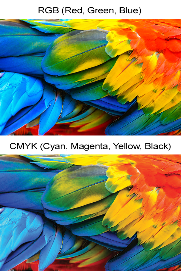
A comparison between RGB and CMYK colour, the result is more noticeable on printed media, than on a computer monitor.
RGB vs CMYK a Comparison
| Feature | RGB | CMYK |
|---|---|---|
| Best Use | Digital screens, websites and social media | Commercial printing and professional print products |
| Colour Model | Red, Green and Blue (additive) | Cyan, Magenta, Yellow and Black (subtractive) |
| Colour Range | Wider colour gamut with brighter, more vibrant colours | Smaller colour gamut designed for accurate print reproduction |
| Print Ready | No – should be converted before printing | Yes – the standard colour mode for printing |
| Appearance | Colours appear brighter on screen | Colours may appear slightly less vibrant but reflect the printed result |
| Common File Types | PNG, JPEG, GIF | PDF, TIFF, print-ready PDF |
| Recommended For | Websites, digital graphics and presentations | Flyers, business cards, brochures, posters, banners and packaging |
For a further, more in-depth look into RGB vs CMYK, check our article here. Is your colour still not as intended, even after evaluating whether RGB vs CMYK might be the problem? Check out this article for a potential solution.
Outcome is still different from screen to print? Check out our article here for some in-depth assistance as to why.
Bleed & Crop Marks Guide
Bleed and crop marks are essential for ensuring your artwork is printed and trimmed correctly. They tell the printer where the final document should be cut and help prevent unwanted white edges or important design elements from being trimmed away. While they can seem confusing at first, understanding how bleed, crop marks and safe zones work is one of the most important aspects of preparing artwork for print.
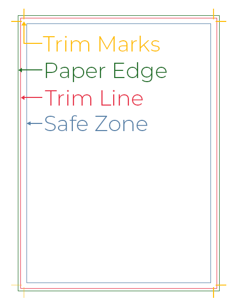
Trim Marks
Trim marks, also known as crop marks, are essential marks on a print-ready file that indicate to the printer where to cut. Because commercial print jobs require a bleed area, an additional 3–5 mm (depending on the print company) is left outside the finished document to be trimmed away, ensuring the design extends cleanly to the edge of the final print.
Trim Line
Trim lines are a user friendly visualization of where the bleed area is on your print, helping you accurately plan around bleed.
Safe Zone
The safe zone is the area of your print where all crucial content should be placed to avoid it being cut off during trimming or appearing too close to the edge. Safe zones are an important print design guideline that adds professionalism to your work and demonstrates careful planning throughout your design.
How to Set Up Print Marks
Print marks can be added easily using popular design applications such as Adobe InDesign, Illustrator and Photoshop when exporting your artwork. They can also be applied when creating a print-ready PDF using Adobe Acrobat or other PDF software. If your artwork has already been designed with bleed and safe zones in mind, many online tools and commercial printers can also add print marks for you. However, it's important to remember that print marks cannot compensate for artwork that hasn't been prepared correctly, so planning for bleed and safe zones from the start of the design process is always recommended.
The GD Print Difference
At GD Print, we estimate that around 80% of our customers either haven't prepared their artwork for print, haven't applied print marks, or are unsure how to do so. While many large-scale printers will print artwork regardless, expecting customers to have the necessary knowledge, GD Print understands that preparing files for print can be confusing.
To help, GD Print offers a free print mark application service and will notify customers if we believe important content may be lost during the printing process. Where only minor adjustments are needed, we'll make them for you to ensure your artwork is ready for print. Additionally, we've created a range of guides to help you better understand crop marks, bleed and how to design artwork with print marks in mind. You can read our guide to crop marks here, or learn more about designing artwork for print marks in our dedicated guide here.
Understanding DPI
DPI (dots per inch) refers to the resolution of an image when it is printed. In simple terms, it determines how much detail is contained within a given area of your print. A higher DPI generally produces sharper, more detailed results because more image information is packed into each inch of the printed design. However, higher-resolution images also create larger file sizes, so it's important to balance image quality with practical file management.
Why is DPI Important
DPI is important because it represents the balance between image quality and file size. A higher DPI is not always the best option, as the ideal resolution depends on how the image will be used. For digital content, such as websites and social media, lower-resolution images of around 72-100 DPI are often preferred because they reduce file sizes and improve loading speeds without noticeably affecting on-screen quality.
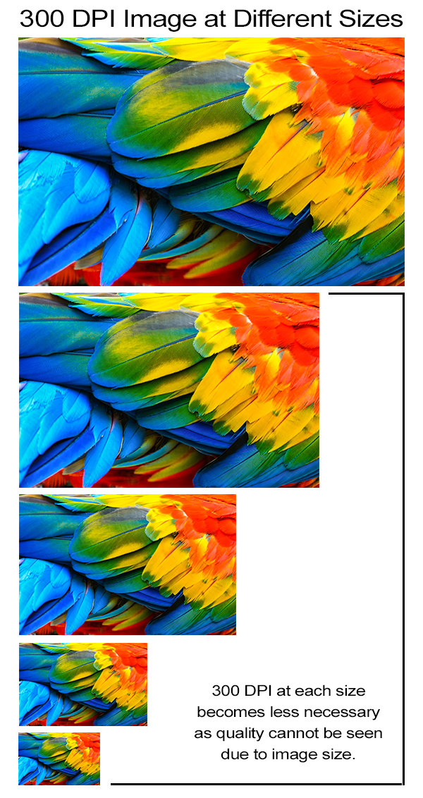
For most professional printing, a resolution of around 300 DPI is generally recommended to ensure images appear sharp, detailed and free from visible pixelation. Higher resolutions of 600–1200 DPI may be beneficial for line-based artwork, such as comics, technical drawings and diagrams, where fine detail and crisp edges are essential.
Large-format printing, however, typically requires only 35–200 DPI, as it is designed to be viewed from a greater distance, making extremely high resolutions unnecessary.
What's the best DPI for my Project?
Consider your intended use case. Are your images designed for a poster on a wall or a banner displayed on a building? Will they be used both online and in medium-sized print? For most print applications, the industry standard is around 300 DPI, providing a good balance between image quality and file size.
Recommended DPI for your Project
| Use Case | Recommended Resolution | Typical Viewing Distance | Why This Resolution |
|---|---|---|---|
| Website Images | 72-150 PPI | 30-70 cm | Smaller files improve page loading speeds while maintaining good on-screen quality. |
| Social Media Graphics | 72-150 PPI | 30-70 cm | Optimised for digital displays where file size is more important than print detail. |
| Flyers & Leaflets | 300 DPI | Hand-held | Produces sharp text, graphics and photographs. |
| Business Cards | 300 DPI | Hand-held | Ensures crisp text and fine details at a small size. |
| Brochures & Booklets | 300 DPI | Hand-held | Industry standard for high-quality commercial printing. |
| Posters (A4-A1) | 300 DPI | 0.5-2m | Delivers excellent image quality when viewed up close. |
| Line Art, Comics & Technical Drawings | 600-1200 DPI | Hand-held | Preserves fine lines, sharp edges and intricate detail. |
| Large Format Posters | 150-200 DPI | 1-3 m | High enough for close viewing without unnecessarily large file sizes. |
| Banners & Exhibition Graphics | 75-150 DPI | 2-10 m | Viewed from further away, so lower resolutions remain visually sharp. |
| Billboards & Building Wraps | 30-75 DPI | 10 m+ | Extremely large graphics rely on viewing distance rather than high pixel density. |
Vector vs Bitmap Images
Vector and bitmap are the two primary types of graphics used in print, each with its own characteristics and ideal applications. While they may appear similar at first glance, they are fundamentally different. A vector graphic cannot be a bitmap image, and a bitmap image cannot be converted into a true vector without being recreated.
Bitmap
Bitmap graphics are the most common type of image. Made up of individual pixels, they are used for photographs, digital artwork, scanned documents, diagrams and most of the images you see on a computer.
Bitmap images are the easiest and most flexible image type to work with. Unlike vector graphics, they are not limited to shapes or defined lines and can contain a high level of detail, texture and colour variation. However, because they are made up of individual pixels, they are less scalable.
Vector
Vector graphics are a unique type of image that is scaleable without losing quality. Vector images are technically computer images created using a sequence of commands or mathematical statements. [Ben Lutkevich, TechTarget, 2021]
Typically created using applications such as Adobe Illustrator, vector images are more structured than bitmap images, consisting primarily of shapes, paths and solid or curved lines rather than individual pixels.
Which should I use?
In many cases, you won't have much choice over the image type you use. Images downloaded from stock websites or captured using a camera or smartphone are naturally bitmap images.
Vector graphics are best suited to artwork that needs to be scaled without any loss of quality, such as logos, icons, banners and billboards. Bitmap images are the preferred choice for photographs, digital artwork and any design that contains complex textures, gradients or fine detail.
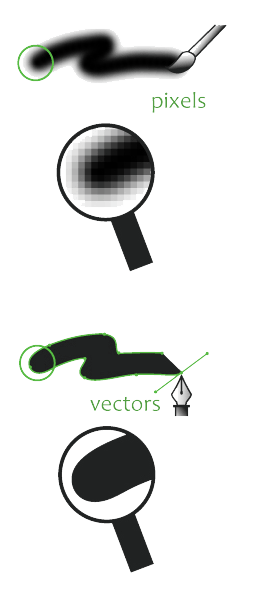
Source: Filecamp
Fonts for Print
Fonts are another important consideration when designing your artwork, and finding the right typeface for your project can be a challenge in itself. Fortunately, there are many well-established fonts and font families that have become staples of modern design.
To help you choose the right font for your project, we've compiled a list of popular typefaces, their common use cases and the reasons they've remained customer favourites throughout GD Print's 40+ years in the printing industry.
| Font | Category | Common Use Cases | Why It's Popular |
|---|---|---|---|
| Arial | Sans-serif | Business documents, brochures, flyers, presentations | Clean, professional and highly legible. Available on almost every computer. |
| Helvetica | Sans-serif | Branding, signage, marketing materials | Renowned for its clean, timeless appearance and exceptional readability. |
| Calibri | Sans-serif | Office documents, reports, presentations | Modern and easy to read, making it a common choice for business communications. |
| Times New Roman | Serif | Books, reports, academic documents | Traditional, formal and highly readable for large amounts of text. |
| Georgia | Serif | Magazines, brochures, websites | Designed for excellent readability in both print and digital formats. |
| Garamond | Serif | Books, luxury branding, invitations | Elegant and sophisticated while remaining easy to read in long passages. |
| Futura | Sans-serif | Posters, advertising, logos | A geometric design that gives a clean, modern and minimalist appearance. |
| Montserrat | Sans-serif | Websites, branding, social media, posters | Contemporary and versatile, making it popular in modern graphic design. |
| Roboto | Sans-serif | Websites, mobile apps, digital marketing | Highly readable with a neutral, modern style that works across many applications. |
| Baskerville | Serif | Editorial design, invitations, certificates | Offers a premium, classic look with excellent readability. |
| Bebas Neue | Display | Posters, headlines, banners | Bold, impactful and ideal for grabbing attention in large-format designs. |
| Impact | Display | Posters, signage, promotional graphics | Thick letterforms maximise visibility from a distance. |
| Comic Sans | Casual | Children's materials, informal notices | Friendly and approachable, although often considered unsuitable for professional designs. |
| Courier New | Monospace | Scripts, technical documents, coding examples | Every character has the same width, making it useful for structured layouts. |
Best File Formats for Printing
Now that you understand DPI, vector and bitmap images, and bleed guidelines, the next step is choosing the right file format for your artwork. Every file format has its own purpose: PNG is ideal for images with transparent backgrounds, JPEG is a widely supported format for general-purpose images, WEBP is optimised for websites, and TIFF is commonly used for high-quality, uncompressed images. PDF is the industry standard for sharing print-ready artwork.
| File Format | Best For | Suitable For Printing | Notes |
|---|---|---|---|
| Print-ready artwork, documents and brochures | Excellent | The industry standard for commercial printing. Supports vector graphics, fonts, bleed, crop marks and CMYK colours. | |
| TIFF | High-resolution photography | Excellent | Lossless image format with exceptional quality. Ideal for professional print where file size isn't a concern. |
| EPS | Logos, illustrations and vector artwork | Excellent | Widely used for vector graphics and scalable artwork, although PDF is now more commonly preferred. |
| AI | Adobe Illustrator projects | Excellent | Native Illustrator format that preserves editable vector artwork. Usually supplied as a PDF for printing. |
| SVG | Logos, icons and web graphics | Good | Scalable vector format, although not accepted by all commercial printers. Often converted to PDF before printing. |
| PSD | Adobe Photoshop projects | Good | Retains layers and editing information but should usually be exported as a print-ready PDF or TIFF. |
| PNG | Graphics with transparent backgrounds | Acceptable | Lossless quality but doesn't support CMYK. Best suited to digital graphics rather than commercial print. |
| JPEG | Photographs and general-purpose images | Acceptable | Suitable if exported at high quality and 300 DPI, but uses lossy compression. |
| BMP | Basic bitmap images | Acceptable | Large file sizes with limited practical use in modern print workflows. |
| WEBP | Websites and online graphics | Not Recommended | Designed for web optimisation rather than printing. |
| GIF | Simple web graphics and animations | Not Recommended | Limited to 256 colours, making it unsuitable for quality printing. |
| HEIC | Smartphone photography | Acceptable | High image quality, but compatibility varies. Often converted to JPEG, TIFF or PDF before printing. |
| RAW | Professional camera photography | Editing Only | Contains maximum image data but must be processed and exported before being suitable for printing. |
Paper Size Guide
Paper size is one of the simplest and most practical aspects of the printing process. With a ruler, you can quickly determine the dimensions you need for your print. However, it's important to decide on your final print size before you begin designing. Scaling artwork from A4 to A0+, for example, isn't always possible without a noticeable loss in quality.
Quick Paper Size Chart
| Paper Size | Dimensions (cm) | Common Uses |
|---|---|---|
| A0 | 84.1 × 118.9 cm | Large posters, technical drawings, exhibition displays |
| A1 | 59.4 × 84.1 cm | Posters, presentation boards, signage |
| A2 | 42.0 × 59.4 cm | Posters, artwork, promotional displays |
| A3 | 29.7 × 42.0 cm | Menus, certificates, folded leaflets, small posters |
| A4 | 21.0 × 29.7 cm | Letters, documents, flyers, brochures |
| A5 | 14.8 × 21.0 cm | Leaflets, booklets, invitations, greetings cards |
| A6 | 10.5 × 14.8 cm | Postcards, flyers, promotional cards |
| A7 | 7.4 × 10.5 cm | Tickets, gift tags, pocket-sized cards |
| A8 | 5.2 × 7.4 cm | Business labels, product tags |
| DL | 9.9 × 21.0 cm | Compliment slips, flyers, envelopes |
| Square (Small) | 14.8 × 14.8 cm | Greetings cards, invitations |
| Square (Large) | 21.0 × 21.0 cm | Brochures, photo books, premium flyers |
If you'd like a more detailed explanation, take a look at our guide to poster sizes, where we explore each format in more depth. If you're still unsure which size is best for your project, our article on choosing the right poster size can help you decide.
Exporting Print-Ready Files
Exporting your artwork is one of the most overlooked stages of preparing files for print, particularly for large-format projects. Without realising it, you may be compressing your artwork, exporting it in a file format that isn't ideal for printing, or scaling it to fit a page without considering how it will be produced commercially.
Exporting your file without unnecessary compression is one of the most important steps in preparing artwork for print. Some of the default export settings in popular software can compress PDFs, omit bleed and crop marks, or alter your colour settings, all of which can affect the quality of your final print.
Not only can the quality of your print suffer, but without bleed and crop marks your chosen printer may proceed with production without contacting you, applying the marks themselves and potentially trimming away important parts of your design.
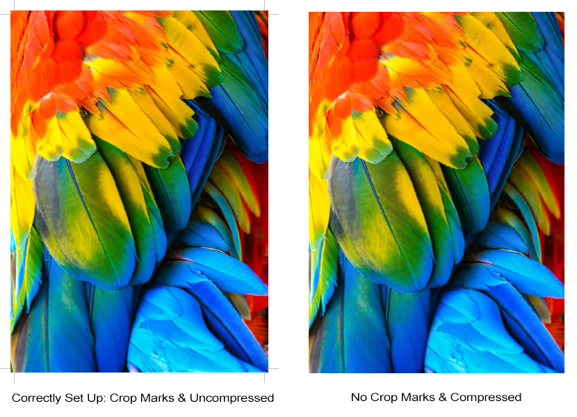
Uncompressed vs Compressed Example
Exporting Uncompressed PDFs
For most commercial print jobs, start by exporting your artwork as a PDF. This is the industry-standard file format because it preserves image quality, fonts, vector graphics and page layout.
When exporting from Adobe applications:
- Select PDF as the file format.
- Choose the High Quality Print preset.
- Ensure your artwork extends to the bleed line.
- In the Marks and Bleeds tab, enable Trim Marks and Use Document Bleed Settings.
- Check that your document is exported using the correct CMYK colour profile.
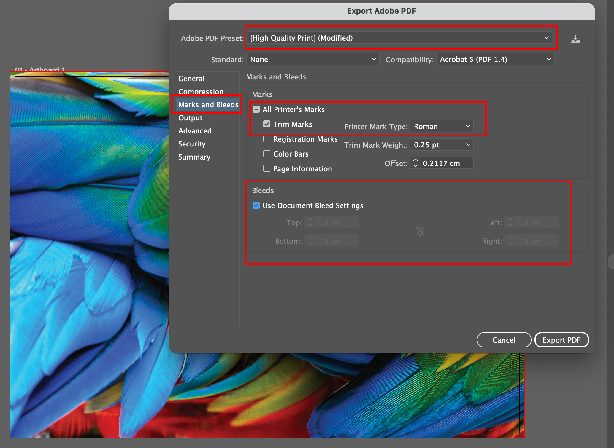
Setting Up Bleed and Default High Quality Settings
Exporting PNGs & JPEGs
When exporting images from Adobe applications:
- Decide whether the image is intended for print or digital use.
- Export as PNG if you need a transparent background or want to preserve the highest possible image quality.
- Export as JPEG if a smaller file size is more important and transparency isn't required.
- For print, export at 300 DPI (or higher where appropriate) using the correct CMYK colour profile.
- For web, optimise the image for screen use by exporting at an appropriate resolution and using the RGB colour profile.
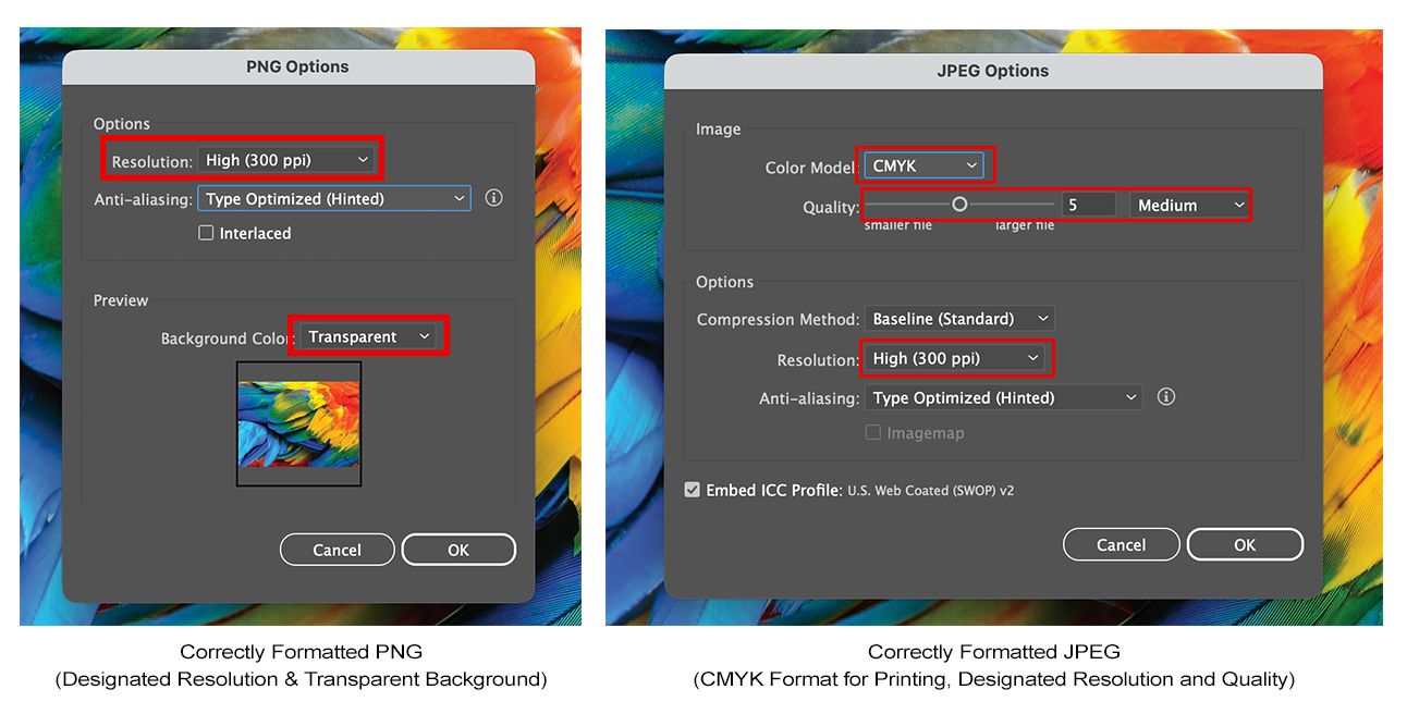
Setting Up Correct Image Resolution, Colour and Quality
Print Finishing Guide (Foil, Spot UV, Embossing and More)
Print finishes are the final stage of the printing process, transforming a standard print into a premium product. Whether you're producing business cards, brochures, packaging or marketing materials, the right finish can enhance the appearance, improve durability and help your design stand out from the competition.
Like every other aspect of print preparation, it's important to design with your chosen finish in mind. Processes such as Spot UV, foiling and embossing each have their own artwork requirements, limitations and setup guidelines.
| Print Finish | What It Is | Appearance | Best Used For | Available at GD Print |
|---|---|---|---|---|
| Matt Lamination | A protective film applied to the printed surface. | Smooth, non-reflective, premium finish. | Business cards, brochures, booklets. | Yes |
| Gloss Lamination | A protective glossy film. | Bright, reflective colours with added durability. | Flyers, menus, covers, promotional materials. | Yes |
| Soft Touch Lamination | A luxury laminate with a velvet-like texture. | Soft, silky feel with a premium appearance. | Luxury business cards, packaging, invitations. | Yes |
| Spot UV | A high-gloss varnish applied to selected areas. | Shiny highlights contrasting against a matt surface. | Logos, titles, packaging, business cards. | Yes |
| Digital Embossing (Scodix) | Raised clear polymer applied digitally to selected areas. | Raised, tactile effect without using traditional metal dies. | Premium business cards, packaging, brochures. | Yes |
| Foil Blocking | Metallic foil applied using heat and pressure. | Reflective metallic finish in gold, silver and other colours. | Luxury stationery, invitations, packaging. | Yes |
| Traditional Embossing | Paper is physically raised using matched dies. | Elegant raised design that can be seen and felt. | Certificates, invitations, premium stationery. | Yes |
| Debossing | Design is pressed into the paper surface. | Recessed, tactile impression. | Luxury branding, packaging, business cards. | Yes |
| Die Cutting | The printed sheet is cut into a custom shape. | Unique shapes beyond standard rectangles. | Packaging, swing tags, promotional products. | Yes |
| Perforation | Small holes create an easy tear-off section. | Clean detachable section. | Tickets, vouchers, raffle tickets. | Yes |
| Round Corners | Corners are trimmed into a radius. | Softer, modern appearance. | Business cards, loyalty cards, postcards. | Yes |
| White Ink Printing | White ink printed onto coloured or transparent materials. | Bright white graphics on dark or clear substrates. | Window graphics, coloured stocks, acrylics. | Yes |
| Varnish | Protective coating applied across the entire sheet. | Available in matt, silk or gloss finishes. | General commercial printing. | Yes |
For information on how to set all these files up, check out our article here.
Ready to Print? Use GD Print
Now that your files have been prepared with the correct bleed and crop marks, are free from pixelation and have been exported in the appropriate format, the final step is choosing the right print provider.
At GD Print, we combine competitive pricing with premium-quality materials, including high-quality silk and Fedrigoni papers, alongside state-of-the-art printing technology and a wide range of professional print finishes to ensure your artwork looks its very best.
| Feature | GD Print | Typical Online Printer |
|---|---|---|
| 40+ Years of Professional Print Experience | Yes | No |
| UK-Based Printing | Yes | Varies |
| In-House Production | Yes | Often Outsourced |
| Speak to a Real Print Expert | Yes | Often Automated Support |
| Dedicated Customer Support | Yes, 9am-5pm via Phone and Website | Limited or Ticket Based |
| Free Artwork Checks | Every Order | Basic Automated Checks |
| Free Bleed & Crop Mark Setup | Yes | No, or Automated |
| Artwork Corrections | Minor Adjustments | Usually Not Included |
| Customer Approval Before Printing | Every Order | Often Automated |
| Professional Graphic Design Service | In-House, Affordable, One-to-One Designer | Limited or Unavailable/Outsourced |
| Digital Proofs & Mock-Ups | Yes | Available on Selected Products |
| Custom Print Quotes | Yes | Limited to Standard Products |
| Bespoke Printing Solutions | Yes | Limited |
| Premium Paper Stocks | G.F Smith, Fedrigoni and More | Standard Stocks |
| Large Format Printing | Yes | Yes |
| Installation Services | Yes | Rarely Offered |
| Low Minimum Order Quantities | Yes | Product Dependent |
| Eco-Friendly Printing | Sustainable Materials & Charitable Donations with Every Order | Varies |
| Manufactured In-House | Almost All Products | Varies |
Why Choose GD Print?
With over 40 years of experience, GD Print combines knowledgeable UK-based customer support and high-quality in-house production to ensure every order receives the attention it deserves. Every file is checked by a real person before it goes to print, with free artwork pre-flight checks, bleed and crop mark setup, and minor adjustments included where needed. Combined with premium G.F Smith and Fedrigoni papers, specialist print finishes, low minimum order quantities and environmentally conscious printing practices, GD Print is committed to delivering exceptional quality and outstanding customer service from start to finish. Contact us here to get started with your printing journey.

