Understanding Colour Settings for Print: RGB vs. CMYK
A Guide to Print Colour Settings: RGB vs. CMYK for Perfect Printing Results
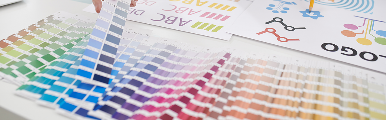
When it comes to printing, understanding colour settings is essential to getting the best possible results. Whether you’re designing brochures, posters, or any other print material, the right colour mode ensures your final product looks just as good as it does on screen, in this guide, GD Print is here to help. With our 40+ years of experience and thousands of print jobs completed, we’ll walk you through the key differences between RGB and CMYK colour settings, and how to choose the right one for your print projects.
What Are RGB and CMYK?
Before diving into the specifics of how to use RGB and CMYK in your designs, let’s break down what they are:
• RGB: Stands for Red, Green, and Blue. It’s the colour model used for digital screens.
• CMYK: Stands for Cyan, Magenta, Yellow, and Black (often abbreviated as K). It’s the colour model used in the printing process.
Both of these models are used to produce colours, but they are used in different contexts: RGB is for digital displays, while CMYK is for printed materials. Knowing when and how to use each can ensure your colours look vibrant and true to your design.
Why is RGB and CMYK important?
Simply put, colour reproduction, but what is that? Colour reproduction refers to the process of predicting and achieving optimal replication of the colours in an original image through a reproduction system. [source] This ranges from medium to medium, photography to digital displays, but where it is most important is print.
Due to technical limitations, what you see on a screen does not reflect the colours of what you print, this is a problem ranging from small home printers to large scale digital printers. This is important for every industry to know, as you want whatever you create to be accurate between screens and physical, which is where RGB and CMYK become important.
| But printers are evolving, they are always getting more efficient and improving how they process colours and how they use inks. For example, at GD Print we use the most cutting edge printers that can process anywhere from the darkest blacks, to the whitest whites. This new CMYK format, uses a wider colour range of White, Gloss, Orange and Red inks in addition to the standard colours. These additional inks allow for more options for finishes and a much deeper colour depth, than typically available in large format printing. GD Print displays the evolution of printers and how they are always changing to try and meet the most accurate colour reproduction possible! Now then let's break down in depth what RGB and CMYK actually is. | 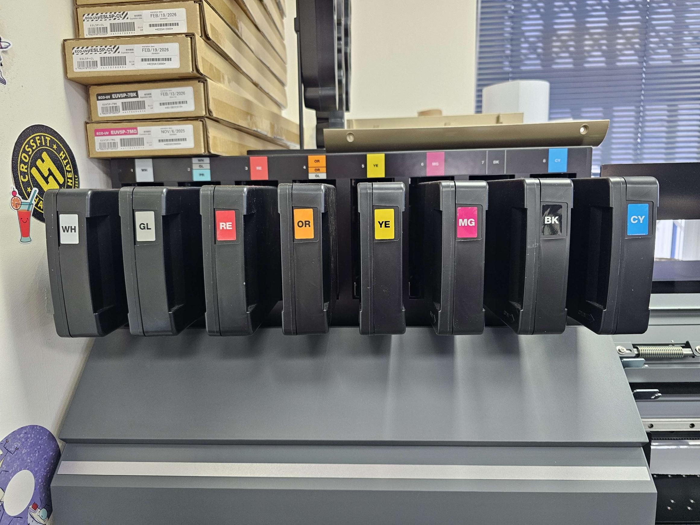 At GD Print, our large format printer and cutter uses advanced ink technology— including not just CMYK, but also white, red, orange, and gloss inks—to deliver a wider, more vibrant colour gamut and enhanced finishing options. |
RGB: The Colour Model for Digital Displays
RGB is ideal and often used for screen-based design, such as websites, social media graphics, and digital advertisements. This model works by mixing different intensities of red, green, and blue light. When combined at full intensity, they create white light, and by varying the intensity, a broad spectrum of colours can be generated.
Key things to know about RGB:
• Purpose: Perfect for web and screen design—everything from websites to digital ads.
• Colour Range: RGB offers vibrant, bright colours due to light emission from screens.
• File Formats: Use file types like JPEG, PNG, or GIF for web and digital media.
While RGB excels in digital designs, it doesn’t transfer well to print. Colours that appear bright on a screen may look washed out or different when printed, as printers work in the CMYK model.
CMYK: The Colour Model for Print
CMYK is used for print designs. This model involves four colours—cyan, magenta, yellow, and black—which are combined in layers to create different colours. Unlike RGB, which uses light to create colours, CMYK uses ink and the subtractive colour mixing method. In this process, adding ink darkens the colour, with the combination of all colours eventually producing black.
Key things to know about CMYK:
• Purpose: Ideal for all printed materials, including business cards, flyers, brochures, and posters.
• Colour Range: CMYK offers a narrower range than RGB, which may cause some colours to look less vibrant in print.
• File Formats: Save files in PDF, AI, or EPS for high-quality print results.
Why RGB vs. CMYK Matters in Printing
The primary difference between RGB and CMYK is the colour range. RGB has a much broader spectrum, which means some bright or neon colours that appear on screen may not be achievable in print. This is particularly important when designing marketing materials or other printed items where colour accuracy is essential.
To get the best results, it’s crucial to convert your design from RGB to CMYK before sending it to print. Many design software options like Adobe Photoshop or Illustrator have this feature, so you can get a preview of how your design will look in print. Here is a quick breakdown in a table format of the differences between RGB and CMYK for printing:
| Feature | RGB | CMYK |
| What it Stands For | Red, Green, Blue | Cyan, Magenta, Yellow, Black (Key) |
| Primary Use | Digital displays (screens, monitors, TVs, web) | Print materials (flyers, posters, booklets, packaging) |
| Colour Creation | Additive colour model (light is added) | Subtractive colour model (light is subtracted) |
| Colour Range (Gamut) | Wider range of bright, vibrant colours | Narrower range; some bright RGB colours can’t be matched in print |
| Best For | Digital graphics, photos for web, video | Printed materials requiring accurate colour reproduction |
| Print Compatibility | Not suitable for printing—must be converted | Industry standard for professional printing |
| Black Creation | Made by combining all RGB colours (can appear greyish) | Uses true black (K) for deeper, richer blacks |
| File Types | JPG, PNG, GIF, PSD (for screens) | PDF, AI, EPS, TIFF (for print) |
| Output Device | Monitors, TVs, phones | Printers, presses |
Tips for Setting Up Colours for Print
To ensure your printed materials look as good as possible, here are some tips for setting up colours:
1. Start in CMYK Mode: If your project is intended for print, start designing in CMYK. This will give you a better idea of how your colours will look on paper, saving time in the long run.
2. Use High-Resolution Images: Aim for a resolution of 300 DPI (dots per inch) to ensure your images are sharp and clear. Web images are typically 72 DPI, which will look pixelated in print.
3. Do a Test Print: If colour accuracy is critical, print a test version of your design. This will help you check how the colours appear on the material before printing the entire batch.
4. Choose the Right File Format: Save your print files in a format that supports CMYK, such as PDF, AI, or EPS. JPEGs or PNGs are generally not ideal for high-quality print jobs.
5. Consult with Your Printer: If you’re unsure about colour accuracy or how to set up your file, don’t hesitate to consult with your printer. They can guide you on how to optimise your design for the best results.
Frequently Asked Questions About RGB vs. CMYK
1. What happens if I print an RGB image?
If you print an RGB file, the colours may appear muted or inaccurate. This is because the printer will convert the colours into CMYK, leading to colour shifts.
2. Can I use RGB for small print jobs?
RGB might be fine for small, non-critical print jobs. However, for professional-grade print materials, CMYK is always the best choice.
3. Can I convert my design from RGB to CMYK?
Yes, most design software allows you to convert from RGB to CMYK. Just be aware that the conversion might cause slight shifts in colour, so you may need to adjust your design.
Final Thoughts
Understanding the differences between RGB and CMYK is crucial for producing high-quality print materials. While RGB is perfect for digital designs, CMYK ensures that your colours translate accurately to paper. By choosing the right colour mode, using high-resolution images, and saving your files in the appropriate format, you can create print products that look professional and vibrant.
Whether you’re designing business cards, brochures, or posters, having a solid understanding of colour settings will help you achieve the best possible results. Happy designing!