What Not to Include on a Poster
What Not to Include on a Poster
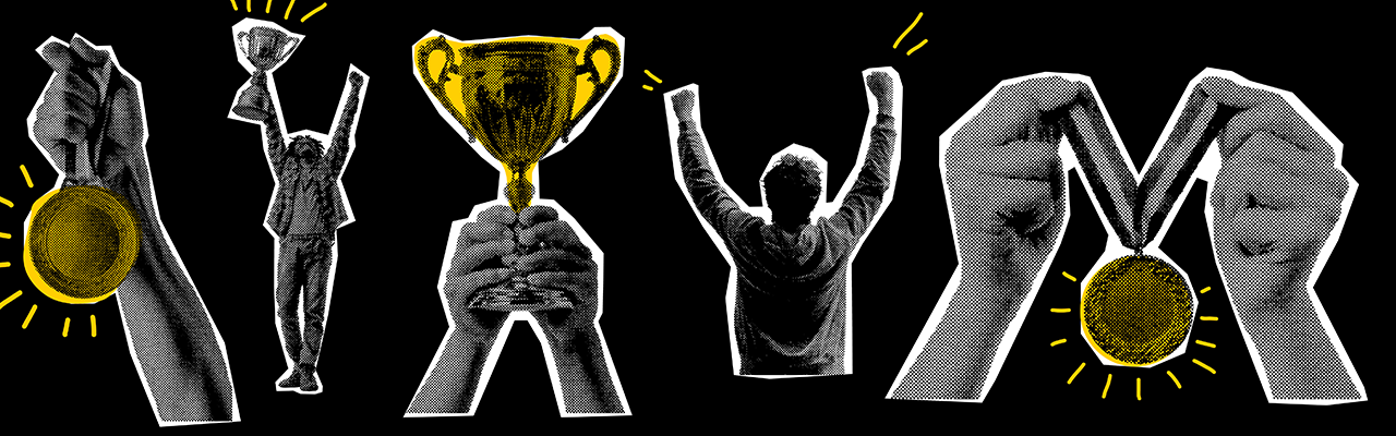
Posters are a great way to advertise your event, product or service. They provide a foundation to advertising your business with the versatility to display it in your aesthetic, so your customers know exactly what your business entails. Some even become collectable due to there iconic designs, think Keep Calm And Carry On posters or famous movie posters like Jaws. In fact, according to blowUP media, large format billboards and posters caused a 9% uplift in brand favorability and 49% of individuals could remember the special campaign that was advertised. [blowUP media] This makes posters essential when you want to advertise your business, from the high conversion rate to the recognisability you can receive from just a poster.
However, now you know why posters work, how do you design a poster and what do you want to avoid? This is what GD Print and its 40+ years of experience will answer within this article. We have formatted this in a concise, do's and don't format with clear examples to show you the design process; complete with a good and bad poster design comparison at the end.
Title and Font Size
Font and title size are an important factor when designing your custom poster. Too large and the balance can be thrown off, leaving no room for important images, text or social media information, but too small and the text is illegible and hard to understand. Additionally, what do you write for your titles? Descriptive and highly informative text, or engaging but less informative slogans and puns to keep the users interest? Throughout GD Print's 40+ years of printing and designing posters, we have noticed patterns in which posters are typically successful, compiling a compact list of some of the main points you should look out for.
Snappy and Short
Make your poster title quick and to the point, it should tell the user what the product is but not overwhelm them with information, save that for the website or the leaflet. The context of your poster should determine the level of seriousness that your poster title should be, if you're advertising a makeup brand for example you can be more lenient, relying on slogans or catchy titles. However, if your poster is relating to government legislation or germ prevention for example, then you should be direct and to the point, but still keep it short.
| Do Keep your poster quick and to the point, whilst considering context | Don't Bloat your poster with useless and unnecessary information |
Title Size
|
The size of your poster title will always vary, no fixed pt will determine the optimal size for your title. In fact, according to this paper on biophysics, a scientific recommendation is simply make your title large enough to be read easily from a considerable distance (say, 25-50 feet) [BUMC], proving that there is no magic font size, but there are definitive considerations. Rule of Thirds A common concept used in design in general is to divide your work into 3 sections, giving each part adequate room to breathe. White Space Utilize whitespace to add interest to your title. Too large and your title will look busy and attract less attention. Consider Your Print Bleed Keep your title within the print bleed, extending past it will cut it off within the printing process | 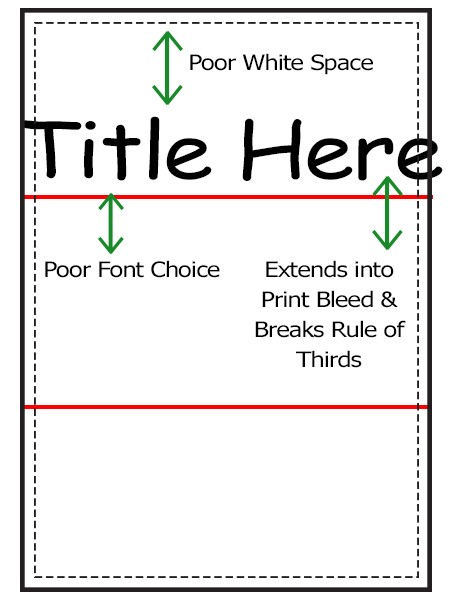 |
| Do
Consider how your poster title will look by using these rules, honing your design skills and envisioning the end result. | Don't
Rush your poster title by not consider the end result and implementing graphic design concepts. |
Images & Placement
Images must be carefully considered when planning your poster design, too many and it can be cluttered, too little and it becomes a block of text. They are the foundational core that can make a boring design interesting, but how do you use them?
Logical Order Structure your images and paragraph in a logical format that is easy to follow. Position yourself in the readers place, can you clearly follow a route throughout your design, do you notice your eyes darting around? By having little structure with images and text all around your poster, you lose the clarity a poster can provide. Overlapping Text and Images By overlapping your title over your images you take away from the impact an image can provide, making it look cramped and condensed. By combining two elements with little intention you reduce the impact each part can provide on a poster individually. However, intention is what is most important to remember, if you plan on using contrasting colors, strong contrast between image and text, or multiple other design decisions to intentionally break the rule, then this recommendation can become obsolete. Context Provide relevant, contextual images that reflect the tone of the poster. They should be relevant to what the event should represent. | 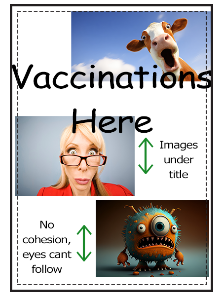 |
| Do Structure your images in a readable format, using images to aid and support text, without any of them unintentionally overlapping or conflicting with one another. | Don't Stuff your images on a page without any consideration of why, where or how you are going to use them, leading to messiness and lack of clarity. |
Paragraphs and Text
Text is the last building block and how you transfer most your information to the reader. According to a 2018 PPI survey, posters have a 45% recall rate, making them quite effective for displaying information to your audience, certifying the importance of getting this correct. [PPI, 2018] Since posters are proven to be fantastic ways to provide information, what should and shouldn't you do with your poster text?
Overlapping Text Text shouldn't overlap images or bleed margins, they should be contained and readable. Text should be a similar font size and not vary much from this. Less is more, start with something consistent as you learn more about poster design. Font Choice and Colour Font choice and colour should be consistent unless you are acting with clear intent. If you are randomly changing the colour or font of your text, your design will look messy and unorganised. | 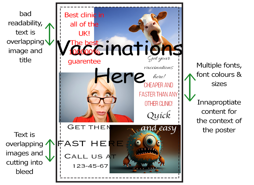 |
| Do Consider your text placement, font and colour. Value font consistency and intent, less is more especially when you need your audience to understand your message within 5 seconds of reading | Don't Have unnecessary text, font and colour choices for seemingly no reason. If you want your text to stand out and use the colour red, commit to that and use it throughout the design; commitment involves intent. |
Summary
There is more to posters than simply putting images and text onto a page and expecting users to understand what you are trying to show them, it involves work and trial and error. You can use these rules as guidelines for your design, but remember that rules are meant to be broken, you could find countless examples of people disproving the rules within this article, but to do so would miss the point, good poster design is about intent. Every choice within your poster is an action of intent and understanding that will lead to a more efficient and improved design.
Let's now exercise these rules and show an improved version of my poster by implementing these design rules with a side by side before and after.
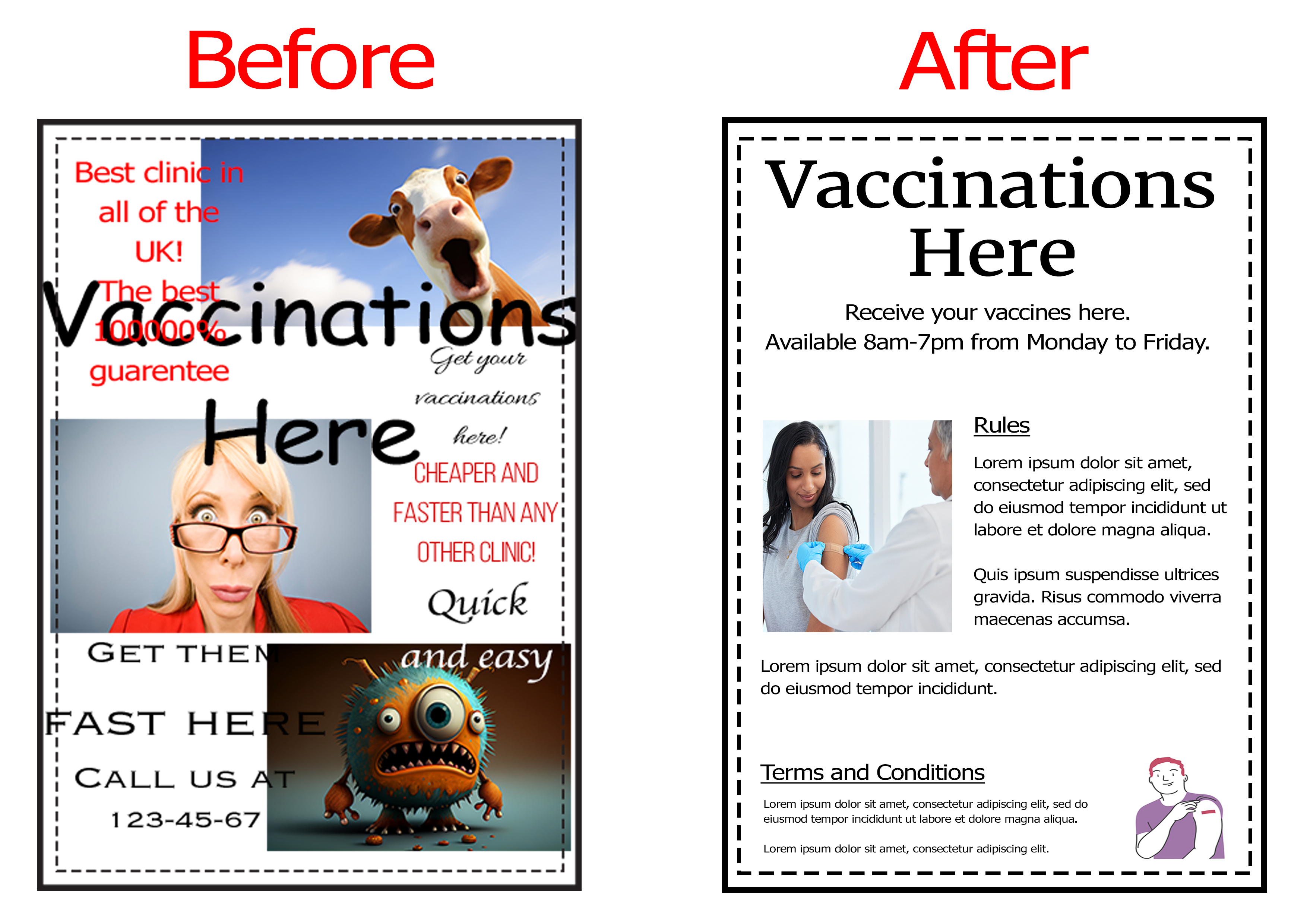
Whilst not pretty, it serves to provide the necessary information within the context of what this mock poster is for. Notice how I broke some rules to emphasise my previous point, even though for traditional use cases there should be less words on a poster, in this instance, the audience will likely stop to read this poster, meaning more text can be used. Additionally, I stuck to an informative style with no vibrant colours as I do not need to attract attention, neither do I want to alarm any readers within a potentially stressful environment.
This goes to show how contextual poster design is and how it is important to follow rules, but also know when to break them. Don't be so strict and design with reason, a great design will follow suit.
Ready to Print? Start with GD Print
Now you know what to avoid when designing a poster, it’s time to bring your ideas to life with high-quality printing you can rely on. At GD Print, we combine professional printing technology with premium materials to ensure your posters stand out for all the right reasons.
Whether you’re promoting an event, advertising your business, or creating eye-catching displays, we offer a range of sizes, finishes, and custom options to suit your needs. With vibrant colour, sharp detail, and fast turnaround times, you can trust us to deliver results that make an impact.
Start your poster printing journey today with GD Print and create designs that not only look great—but get noticed.
Bringing 40+ years of print expertise to businesses across the UK. GD Print specialises in high-quality, eco-friendly printing for every occasion.