Why Do Printed Colours Look Different?
Why Do Printed Colours Look Different?
If you’ve ever found yourself asking why do my prints look different, or why do printed colours look different, you’re not alone, customers frequently ask us why printed colours are different to the screen and how this can be prevented. From incorrect Pantone and Hex colour values, to differences between printers, papers and printing processes, achieving your desired colour can often be a frustrating experience.
The answer, however, is rarely straightforward. Colour differences can be caused by a range of factors, including printer calibration, paper stock, colour profiles, lighting conditions and even colour theory itself. In this guide, we’ll explain the most common causes of colour variation and answer the question: why do printed colours look different?
RGB vs CMYK: The Common Solution
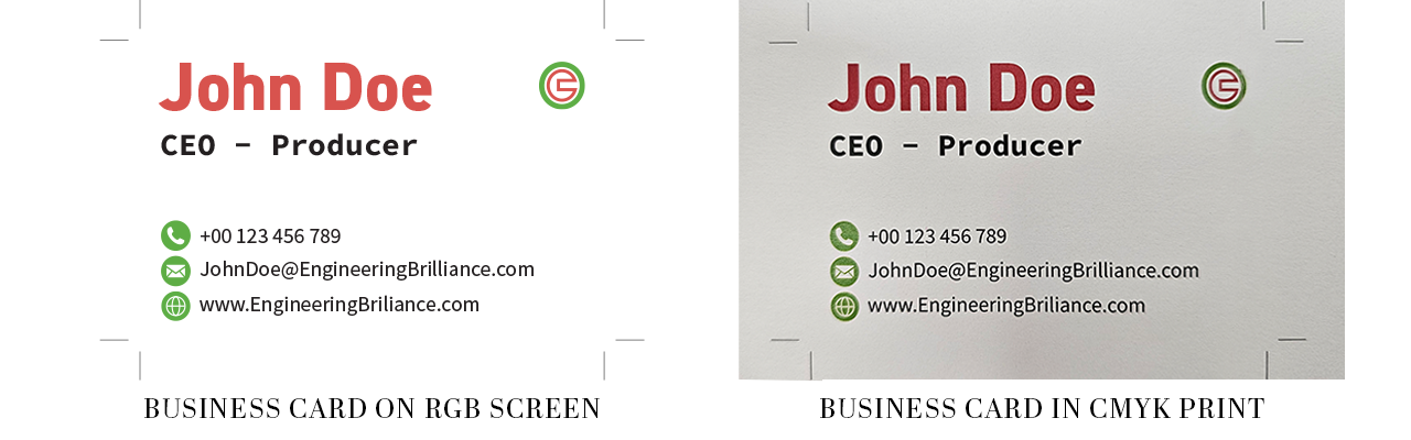
Colour profiles are the most common reason printed colours are different to screen. A colour profile determines how colours are interpreted and reproduced on different devices. Computer monitors, phones and tablets typically display colour using the RGB (Red, Green and Blue) colour model, while the vast majority of commercial printers reproduce colour using CMYK (Cyan, Magenta, Yellow and Black). Although both systems are designed to produce a wide range of colours, they do so in fundamentally different ways. RGB is an additive colour model, creating colour by combining light emitted from a screen. Because it uses light, RGB has a significantly wider colour gamut than CMYK and can display bright, highly saturated and neon-like colours that simply cannot be reproduced with printing inks. CMYK, on the other hand, is a subtractive colour model, creating colour by layering inks onto a surface and reflecting ambient light back to the viewer. As a result, some colours that appear vibrant on screen will naturally look less saturated when printed.
It’s important to note that this doesn’t make CMYK less accurate, it simply has a smaller achievable colour gamut. A professionally calibrated CMYK printer will reproduce colours consistently and accurately within its printable range, but colours that fall outside that range must be converted to the closest possible match. This colour conversion is the most common reason people ask why do my prints look different after seeing a design on screen. While there are specialist printing technologies that use expanded ink sets or dedicated spot colours, such as Pantone inks, the overwhelming majority of digital and lithographic commercial printing is produced using CMYK. For this reason, it’s always recommended to design and proof artwork in a CMYK colour space when preparing files for print. Doing so provides a much more realistic representation of how the finished product will look and helps avoid unexpected colour shifts between screen and print.
Here is a quick comparative table:
| RGB | CMYK |
| Digital Screens | Printed Materials |
| Light-based | Ink-based |
| Wider colour range | Smaller colour range |
| Bright, vibrant colours | More muted, realistic colours |
For a further, more in-depth look, on how RGB is different to CMYK, check out our article here.
Calibrating Your Monitor
Each monitor has its own colour settings, which can make colours appear different from screen to print, but even from screen to screen. Although each monitor will output in RGB rather than CMYK, colour accuracy between monitors can vary dramatically. If you have an OLED monitor and your colleagues have LED monitors, the colours will appear more vibrant compared to your colleagues’ screens, leading to even more disappointment when comparing screen to print. Additionally, brightness and contrast settings can differ at factory level on each monitor, so the results can be altered even further.
It is best to calibrate your monitor to match what your colleagues are working on to provide consistency across screens and designs. Additionally, use the same hex codes for your colours so that you can guarantee colours remain consistent and accurate wherever your work is viewed. Here is an example of how colours can vary across different monitor types.
 source: LG
Paper Changes Colour Appearance
Paper stocks and finishes can altar how colours appear, from a gloss finish or silk or plastic paper making colours pop or shine in correct lighting conditions, to matt lamination of recycled paper dulling colours and making them feel more grounded. Although each printer will use different stocks, here is how your colours will appear on GD print paper stock.
| Paper/Finish | Colour Appearance |
| Gloss | Bright & Vibrant |
| Silk | Balanced |
| Uncoated | Softer |
| Kraft | Warmer |
| Recycled | Slightly Muted |
| Matt Lamination | Softer & Less Vibrant |
| Gloss Lamination | Brighter & More Vibrant |
| Soft-Touch Lamination | Muted & Softer |
| Digital Embossing | Slightly Deeper & More Dimensional |
| Foil Blocking | Highly Reflective & Vivid |
| Spot UV | Glossy & More Saturated |
| Varnish | Slightly Enhanced & Vibrant |
For an in-depth guide on paper types, check out our article here to see what works best for you,
Not Every Colour Can Be Printed
In addition to the differences between RGB and CMYK colour gamuts, not every colour can be successfully reproduced in print without additional finishing or specialist processes. For example, metallic effects are often achieved using foil rather than metallic inks, as producing a truly shiny and reflective metallic effect with standard inks can be difficult, more expensive and less effective.
This applies to several other types of colour as well. Fluorescent and neon colours, along with extremely bright blues and greens, can be affected by the limitations of conventional printing and may appear less vibrant or saturated in the final print. To the right, we have an example of the limitations of what can be reproduced. Even RGB cannot display every possible colour, while CMYK has an even smaller colour gamut and is therefore unable to reproduce some colours visible on screen. This is why preparation is important. Before planning your designs around a specific colour or effect, check whether it can be reproduced using your chosen printing process or whether additional finishing is required. This helps you design with the final print in mind and avoid disappointment when your artwork is produced. | 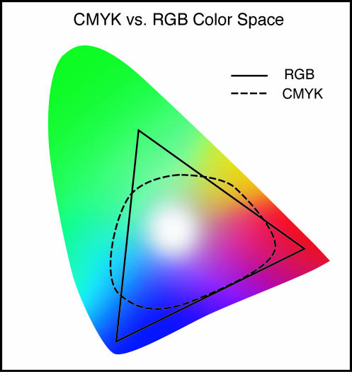 Source: PubMed Central Source: PubMed Central |
Different Printing Creates Different Results
What printer and printing method you use can create a different result. Unlike colour gamuts, specialist printing methods can create brighter, sharper or more reflective outcomes compared to standard printing, but usually at an increased cost. When you have specialist printing needs, you can go to a dedicated printer focused on that type of printing.
Digital Printing - The Standard
Digital printing is one of the most common and widely implemented printing methods, and is what you can expect from most modern printing companies. Using CMYK, digital printing is efficient and cost-effective, with minimal upfront setup costs and good consistency across print. This makes it one of the most popular and effective printing methods that many printers rely on.
Litho Printing - Better For Large Volume Printing
Litho printing, or offset lithographic printing, is a traditional printing method where ink is transferred from a printing plate to a rubber blanket cylinder, and then onto a paper sheet. It is based on the principle of oil and water not mixing. Litho printing is still widely used today, particularly for larger print runs where the initial setup costs can be spread across a high volume of printed material. Litho printing can use specialist inks, including fluorescent, metallic and Pantone inks, allowing you to achieve a wider range of colours and special effects than standard CMYK digital printing. Litho presses can also operate at very high speeds, with some capable of producing upwards of 15,000 sheets per hour, while maintaining a high level of consistency across large print runs. This is the printing method to use if you need a wider ranger of colours, lots of units and specific and precise colour accuracy, but be prepared to pay for it.
Large Format Printing - Large Scale Printing Option
Large format printing and digital printing use similar underlying technology, but they are implemented differently to suit their respective use cases. Large format printers need to cover much larger surfaces and therefore use different ink systems, printheads and application methods. As a result, large format printing is often produced at a lower effective viewing resolution, designed to be viewed from a greater distance rather than up close. The final result can appear slightly grainier or less sharp when viewed closely compared with standard digital printing, but this is less noticeable at the intended viewing distance. Colours may also be adjusted to remain clear and impactful across larger surfaces, making large format printing particularly effective for banners, signage, posters and other applications where the design needs to be easily visible from a distance.
UV Printing - Material & Printer Dependent
UV printing uses ultraviolet light to instantly cure the ink as it is printed, allowing colours to sit more sharply on the surface rather than absorbing into the material. Compared to standard digital printing, UV printing can produce brighter, more vibrant and sharper colours, particularly on coated or darker materials. It can also print white ink, allowing for stronger colour reproduction on coloured or transparent materials. However, the final result will still depend on the material, ink and printer used, so UV printing does not always mean more accurate colour compared to digital printing.
Here is a quick comparison table:
| Printing Method | Colour Reproduction | Best For | Advantages | Considerations |
| Digital Printing | Balanced & consistent | Standard printing & smaller volumes | Cost-effective, & efficient with minimal setup | Standard CMYK colour range |
| Litho Printing | Wider colour range & precise | Large volume printing | Pantone, metallic & fluorescent inks; high consistency | Higher setup costs |
| Large Format Printing | Clear & impactful | Banners, signage & large-scale prints | Designed for viewing at distance; suitable for large surfaces | Can appear less sharp up close |
| UV Printing | Bight, vibrant & sharp | Specialist materials & finishes | Strong colour reproduction; can use white ink | Results depend heavily on material, ink & printer |
How To Get The Best Colour Accuracy
Now we have figured out some possible reasons why your colour may be inaccurate, here are the main ways you can optimise your prints for ideal colour accuracy from screen to print.
1. Monitor Calibration And Room Lighting
Start by adjusting the calibration of your monitor; you want your screen to at least be displaying a reasonably accurate representation of your colours. Whilst each monitor is different, modern screens have different settings such as HDR, Cinema Mode and other display modes that can increase saturation, vibrancy or introduce warmer or cooler tones to your screen, which is not ideal for accurate print preparation. Once these steps are complete, check your monitor brightness. Working at an appropriate, neutral brightness that is balanced with your surrounding environment can make it easier to judge colours accurately and avoid designs appearing darker or lighter than intended when printed.
If you are willing to invest and colour is non-negotiable, you can purchase dedicated monitors with excellent colour reproduction, or devices such as a colorimeter to determine and calibrate the accuracy of the colours on your screen. You can also research colour profiles, which help ensure that colours are interpreted consistently between your monitor, software and printer. Specific research will need to be done to determine which profiles are correct for your particular use case. These steps require further calibration and knowledge to understand and utilise properly, but they can significantly improve colour accuracy and provide more predictable results between screen and print.
2. Use Correct Colour Settings In Your Software
Check and reference colour management settings in your design software. Most professional design applications allow you to work with multiple colour profiles, such as RGB and CMYK, and to soft-proof how your design is expected to appear when printed. If your final output is intended for print, working in the appropriate CMYK colour space and regularly using a CMYK soft proof can greatly aid the design process by showing you which colours may change during conversion.
When working with images, check that they have an embedded colour profile so your software knows how the colours should be interpreted. Avoid making unnecessary changes to both your monitor and software settings, as this can introduce further inconsistencies. Your monitor should be properly calibrated, while your design software should handle the conversion and colour management. Rather than changing your monitor itself to a CMYK view, use the software’s built-in soft-proofing tools where available. This provides a more accurate simulation of how your colours are likely to appear when printed and helps prevent unexpected differences between your screen and the final print.
Here is a table including some popular design software with recommended colour profiles for print:
| Design Software | Recommended colour space/profile for print | Best Practice | Notes |
| Adobe Photoshop | CMYK + printer-supplied ICC profile | Use the CMYK profile specified by your printer and embed it when exporting | Particularly important for photographs and raster artwork. Photoshop supports converting documents to specific output profiles. |
| Adobe Illustrator | CMYK + printer-supplied ICC profile | Set the document to the required CMYK profile and use soft proofing where appropriate | Ideal for logos, illustrations and vector artwork. Adobe recommends using an output profile that matches the printer and paper. |
Adobe InDesign | CMYK + printer-supplied ICC profile | Use the printer’s recommended profile and ensure placed images are correctly colour-managed | Particularly suited to brochures, books, leaflets and other multi-page documents. InDesign supports output profiles specific to the printer and paper. |
| Adobe Acrobat Pro | Match the PDF’s intended output profile | Use Output Preview and Convert Colours where required; don’t arbitrarily change the PDF profile | Best used for checking and preparing an already-exported print PDF rather than designing the artwork itself. |
| Affinity Designer | CMYK + printer-supplied ICC profile | Select the appropriate CMYK profile when creating the document and embed the profile on export | Affinity specifically recommends consulting your print provider for the appropriate CMYK profile. |
| Affinity Publisher | CMYK + printer-supplied ICC profile | Use the required CMYK profile for the document and embed it in the exported PDF | Particularly useful for multi-page print such as brochures, books and magazines. |
| Affinity Photo | CMYK + printer-supplied ICC profile | Convert or create the document using the appropriate output profile and use soft proofing | Similar workflow to Photoshop for photographic and raster-based work. Affinity supports soft proofing for specific output conditions. |
| CorelDRAW | CMYK + printer-supplied ICC profile | Match the document colour settings to your printer’s specifications | Commonly used for signage, vector artwork and commercial print. |
| Canva | CMYK PDF where available | Export as a print-ready PDF and follow your printer’s specifications | More limited colour-management control than professional prepress software, so printer requirements are particularly important. |
| Inkscape | CMYK workflow via PDF/prepress tools | Check the exported PDF carefully and confirm the required profile with your printer | RGB is more central to Inkscape’s workflow, so it may require additional prepress preparation for demanding CMYK work. |
3. Choose The Right Paper Or Finish
When planning for your print it is best to have a paper type in mind, you might not necessarily know the exact brand or GSM, but having a paper type or finish in mind allows for adjustments in colour within the design process. Here are some popular finishes and paper types and how they impact the colour of your print:
| Paper / Finish | Effect on Colour | Best For |
| Gloss | Produces bright, vibrant and highly saturated colours with excellent image definition. Its reflective surface can create glare. | Photography, brochures, promotional print |
| Silk | Offers a good balance between colour vibrancy and readability, with less reflection than gloss. | Brochures, business cards, posters, booklets |
| Matt | Produces a softer appearance with less surface reflection. Colours can appear slightly less vivid than on gloss or silk, although reproduction can still be excellent. | Premium stationery, brochures, reports |
| Uncoated | Absorbs more ink into the paper fibres, generally creating softer, more muted colours and less sharp image detail. | Letterheads, books, stationery, writable print |
| Matt Lamination | Adds a protective, low-reflection surface and can slightly soften colour and reduce perceived vibrancy compared with an unlaminated coated sheet. | Business cards, brochures, premium print |
| Gloss Lamination | Adds a reflective surface that can make colours appear richer and more vibrant while increasing contrast and visual impact. | Packaging, promotional print, photo-heavy materials |
4. Use the Printers Correct Paper and Quality Settings
Check the settings before running your print job. Certain printers have specific settings for different paper types, and selecting the wrong paper type can affect how much ink is applied and how the printer handles the paper, resulting in incorrect colour, faded prints or poor image quality. [HP Support]Make sure the paper type, paper size, print quality and colour settings match the paper you have inserted. For example, selecting a glossy or photo paper setting for the correct stock can change how the printer applies ink and improve the final result. Higher quality settings can also improve detail and colour reproduction, although they may increase print time and ink usage. [HP Support]
Also check that you are printing onto the correct side of the paper, particularly with coated or glossy stocks, as the print side is designed to receive the ink correctly. [HP Support]
5. Make Multiple Test Prints
The most reliable way to check how your final print will look is to do test prints, especially if you are doing large print runs. Try to have the test prints produced on the same printer and paper as your final prints where possible. Enquire about the settings being used, including the colour profile, colour management and print quality, and test them in different sizes or on different papers if necessary. Many printers will offer test prints or proofs for a reduced cost, although this will vary depending on the printer, materials and size of the print.
Occasionally, if a specific paper or required ink type isn’t in stock, printers may need to order it specifically for an order, so test prints using those materials may be unavailable. In this case, use whatever is the closest possible match and be aware that the final result may differ slightly. Printers may also charge more for test prints of larger designs, such as A2+, as they require more material, ink and machine time. However, for a large enough print run, a full-size proof may be worthwhile.
If you need to test a larger-scale print, ask whether a smaller-scale or tiled test can be produced. You can also split the design into sections and stitch together smaller prints to create a rough simulation of how the full design will look. This won’t perfectly replicate the final result, particularly for viewing distance and large-format printing, but it can still help identify major colour or layout issues before committing to the full print run.
Use GD Print For Excellent Colour Accuracy
At GD Print, we understand that achieving consistent and accurate colour reproduction can be affected by many factors, from colour profiles and printer calibration to paper stock, finishes and printing processes. That is why we regularly run colour tests throughout the day to monitor and maintain the performance of our digital printers, helping us achieve excellent and consistent colour reproduction across your print jobs. With a variety of digital printing services, paper stocks and finishes available, we carefully consider the materials and printing settings being used to ensure your artwork is reproduced as accurately as possible. While no printing process can perfectly replicate every colour displayed on screen, our regular testing and quality checks help minimise unexpected colour variations and ensure you receive a reliable, high-quality result.
Contact GD Print here to see what we can print for you.
Bringing 40+ years of print expertise to businesses across the UK. GD Print specialises in high-quality, eco-friendly printing for every occasion.

